10 New RobotWarz Screenshots
June 12, 2010 Posted by Tyler CruzThis will be the last update on RobotWarz for a couple weeks so I thought I’d present you with 10 brand new screenshots of how the game currently looks.
The images lost some quality and don’t look quite as good here due to being resized and saved for the web, but they should still give a good idea as to what the game will look like.
Below you will see 10 new screenshots that the designer just sent me last night. It’s really unbelievable how fast he’s working… scary really 🙂 This is how it should be!
He’s now almost done all the graphics for the game… all that’s left are the icons, a few more weapons, possible add-on’s and textures, and a simple website and logo. That sounds like a lot, but this guy will probably have all that done in 24 hours!
Anyhow, enjoy the screenshots and let me know what you think:
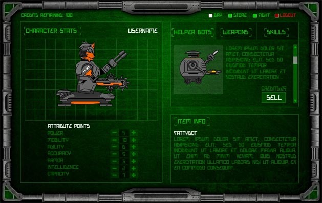
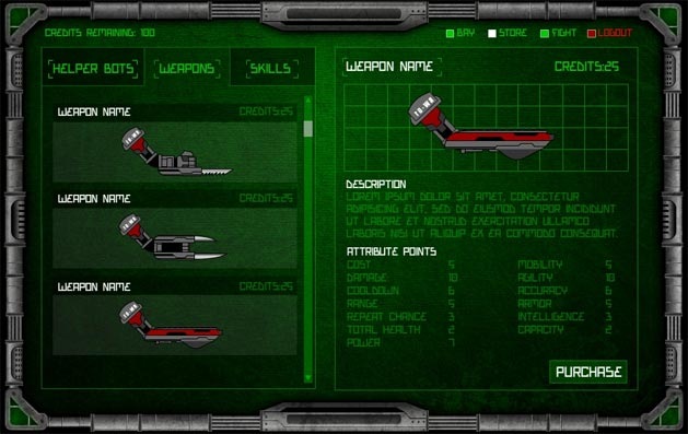
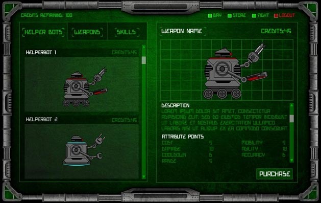
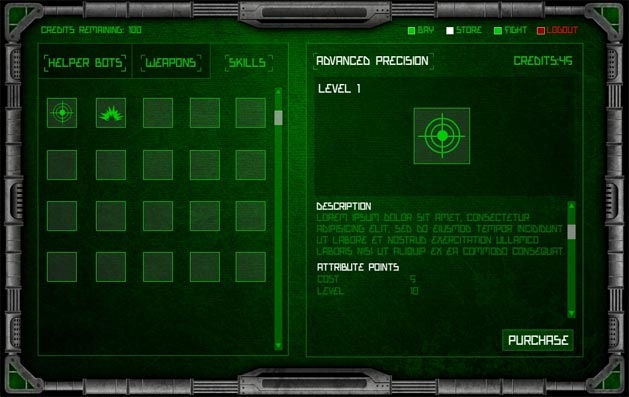
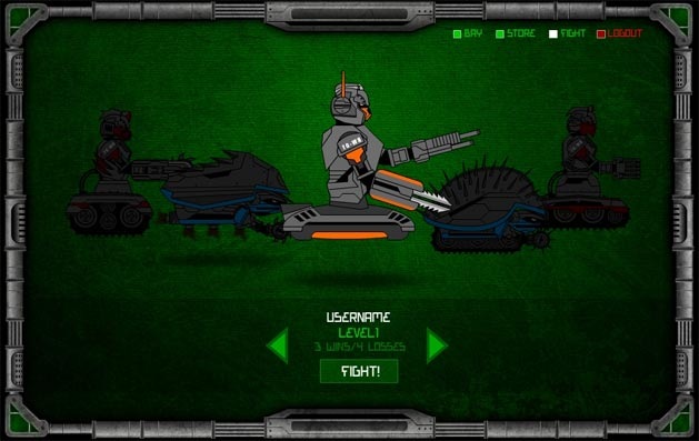
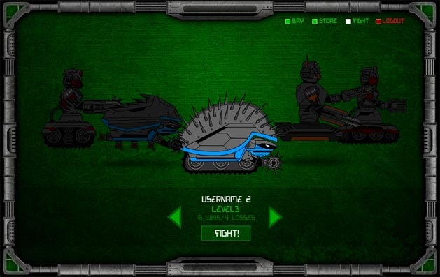
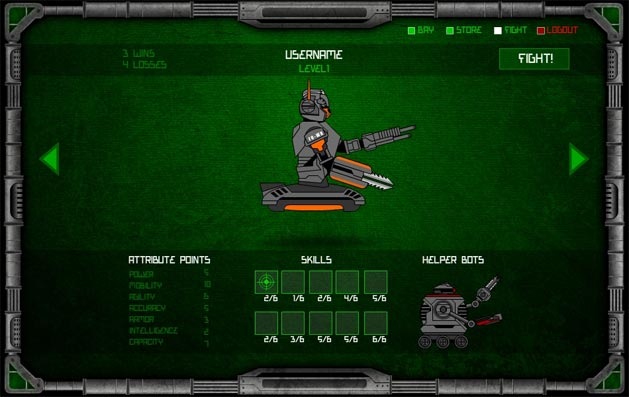
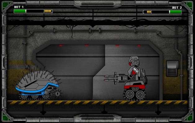

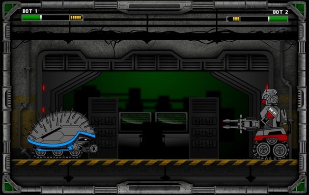


Looks good, just not a fan of the font or font color. The light green font on the dark green background just isn’t constrasted enough. Though that is an easy fix. Perhaps it looks better as it is in a bigger resolution.
I agree. Based on what you can see from the screenshot, the font and colour used are a bit too much effort to read.
Very good indeed Tyler,
its going to be a bomb when you put it online!
Regards
How much money have you invested in the site so far? It looks like it is getting to be really cool, but at the same time it might just be a money pool.
I was wondering that too.
I don’t want to give out exact numbers on this project anymore since it is nearing completion, but the only “unforeseen” additional costs have been the cost of the new designer, which, for what he’s done so far, is great value for money.
Cool! Keep up posted 🙂
Tyler – pull out while you still can. You and I both know this won’t make any money. Go into iPhone game dev.
No need to be so negative. You never know what something can make until you actually try it.
I can tell you this– in my earlier days I made *plenty* of money off of games that were poorly constructed and weren’t anything special at all.
The amount of time and effort put into this game is much more than I put into my initial games.
make this game facebook friendly ya big showoff!!!
Going to have to if you want to make some big money!
Hi guys,
It looks like everything is coming together very nicely. Thanks for sharing.
Kind regards,
Sam
X
Looks like a really cool game, can’t wait till it comes out.
Looking really sharp. Ive never been fond of the MyBrute “run back and forth” fight style, but its looking great.
Wow Tyler, thats awesome! Good to see you are getting another site pumped out man; it looks like it is going to be successful.
Very nice updates and images. I’m interested to know more about the concept of the game and if it has a storyline or something.
Deriving most of my income from building and running browser-based games, I’d say the method of monetisation your chasing is a very poor way to profit from your game.
Speaking first hand, monthly subscriptions only account for a TINY amount of income. One-off purchases such as additional credits, bonus items, etc. are where the money is to be made.
Other ways are novel things that don’t actually directly benefit a player, but are more gimmicky such as pay X dollars and you can have a custom or special appearance for your robot.
I am certainly open to the option of letting players purchase credits in order to upgrade their bot faster/better, but want to see how the paid memberships work out first.
It’s all good to try, but I guarantee you 100% that the one-off purchases are where you’ll make the majority of your money from.
If you want, shoot me off an email and I’ll give you some of the figures from one of my games to show you just what I’m talking about. Or if you just want some general advice on making money from games.
Yeah, I’m not doubting you at all, but it’s just something I’d like to test for myself. I’ll send you an e-mail tomorrow, it’s time to catch up on some FIFA!
I think you’re on the right path Tyler. Games are a hit or miss.
Honestly, I would look into the Droid and Iphone, as those are HUGE right now. Also, hop on the Facebook bandwagon and promote the S out of it 😉
Good luck.
looking forward for the launch
[…] and it’s somewhat related to my current E3 adventures. You see, he’s developing a Robot Warz game and he has no fewer than 10 new screenshots for you to gawk at. Check out some of the cool […]
It looks fun. Is this for free or do I have to pay for something?
Like most of these types of games, it’ll be free to play with option to pay.
From his last post:
“Memberships which offer more fights per day (and thus more opportunities to level up and gain credits, etc.) will be the only option people have in terms of spending money on the site.”
That’s really looking exciting man
This is looking very promising. Looking forward to the launch like the rest of the gang.
Good design. Cool. When you launch it.
Wooww. Cool design..)
This is really, really cool, and now I really, really want to play it. I’m actually working on building a real robot, haha.
A real robot you say =O? What sort are you making (or for what purpose)?
Gaming has a great potential if it went well. Seems like you got a good one on hand. All the best.
Looks good.
Just FYI Tyler – The fonts, colors and styles are nearly-identical to the old Syndicate series of games.
Best wishes,
Martin
:O sweet!
looks great! 😀
It looks awesome Tyler! I can’t wait till it launches.
Screenshots are looking pretty good! Cant wait for the final
I’ll sure be one of the people trying this game out when it does come, since I’ve been watching its development 🙂
Robot Warzzzzzzzzzzzzzzzzzzz! The next farmville?
Will this be done before 2011?
look awesome 😀
I bet this is the last time you take on a project like this. Too much stress..
You need a release date to focus your mind! Deadlines for the win!
I bet this is the last time you take on a project like this.
Very nostalgic. I bet your’re project is going very well
Well I sincerely liked studying it. This information provided by you is very constructive for good planning.
Good design. Cool 😉