PublisherSpot Updates: May 2008
May 22, 2008 Posted by Tyler CruzAs promised in my previous post, here is an update on how PublisherSpot.com is progressing.
There have been a number of great new features added to PublisherSpot during the past two months. Unfortunately, it took a lot longer than originally anticipated due to a number of roadblocks including my server crash, Ukraine (where my programmers are located) having a ton of holidays in the beginning of May, and due to the nature of the features implemented: a lot of bugs that needed ironing out.
But now that everything is finished, it feels good. I can finally do some marketing and promotion before getting started on more features and improvements.
New Features & Improvements Implemented

Editors Choice Feature
The administrator can now reward or designate certain networks with an “Editor’s Choice” badge. If a network is labelled as an “Editor’s Choice”, it receives a small icon next to it’s name throughout the site.
Currently, AzoogleAds, Casale Media, Google AdSense, Tribal Fusion, NeverblueAds, and ValueClick Media have all been afforded this designation.
Improved “Search” Page
PublisherSpot’s search page has been revamped to provide a much cleaner and streamlined look.
Checkboxes for the Search by payment methods and Search by ad creative sections have been programmed to automatically align in straight rows and columns. Previously, they were listed as one checkbox per row which made for very cumbersome searches.
The new search page looks slick.
Bold to Header Tag Conversion
Previously, all of PublisherSpot’s reviews used the BOLD BBCode element as title/headings to separate sections. For example, the review of Casale Media used BOLD for: Features, Controls, Available Types and Formats, Reporting, etc.
For SEO reasons as well as styling practicalities in addition to simply making the reviews more visually appealing, all of these BOLD subheadings were changed to a special BBCode header tag. The new HEADER tags are now their own stylistic element and thus have their own CSS styling applied. The headings now look a lot better, with a larger font and underlined. The best part is that this can easily be modified in the future now that they are all separated as actual HEADER classifications as opposed to a standard bold tag.
Newline Parenthesis Bug Fix
A small bug was fixed in the reviews in which if there was a parenthesis in a list, it displayed it on a new line.
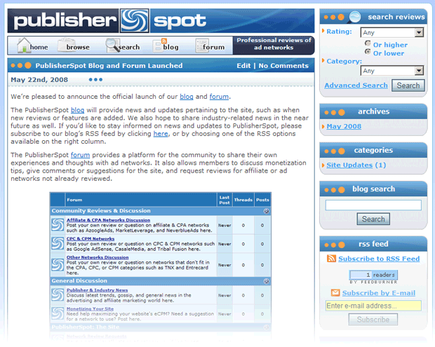
Blog Added
A blog has been added to the site! This turned out to be quite a pain due to the many customizations involved, but in the end it turned out great.
The PublisherSpot blog will provide news and updates pertaining to the site, such as when new reviews or features are added. We also hope to share industry-related news in the near future as well. If you’d like to stay informed on news and updates to PublisherSpot, please subscribe to our blog’s RSS feed by clicking here.

Forum Added
A forum has been added!
The PublisherSpot forum provides a platform for the community to share their own experiences and thoughts with ad networks. It also allows members to discuss monetization tips, give comments or suggestions for the site, and request reviews for affiliate or ad networks not already reviewed.
The addition of the blog and forum is first step towards creating a PublisherSpot community, and there are more features planned which will further intertwine the webmaster and publisher community with PublisherSpot’s reviews and search capabilities.

Upcoming Features & Improvements
I’m going to save the details of new features and improvements that are planned for a future post, but here is a glimpse of what is in the works:
- A PublisherSpot member system in which all 3 member systems (main member system, WordPress, and vBulletin) on the site are merged into one account for usability.
- Possible commenting system on reviews
- Improved review voting system (must be logged-in to vote)
- Special in-house advertising system. I currently have AzoogleAds, NeverblueAds, and MarketLeverage interested in advertising on the site.
- Add a Country feature to reviews, so that networks can be searched by what countries they allow into their networks (requested by many publishers outside of North America).
- Custom 404 pages
More Networks Reviewed
Since my previous PublisherSpot Update post back in March, 6 more networks have been reviewed, bringing the total of networks reviewed on PublisherSpot to 37.
It would have been 38 but ClickBooth is not responding to any of my repeated registration or contact attempts…
Time to Market!
Since the new features are now working bug-free, it’s time to do some advertising. Expect to see a lot of PublisherSpot buzz around the blogosphere soon…
Suggestions and Requests Welcome
While I have a big list of ideas for improvements already, I’d love to hear your own ideas and suggestions as well. How can I improve PublisherSpot?
Also, if there is an ad network you’d like to see reviewed, or you simply know of any that we’re missing, please let me know. I’ll be sure to have them reviewed!


Tyler,
I think each networks needs a dynamic profile rather then simply a review page. For each network you could list different video’s about it, links to blog reviews and most importantly user feedback. Each network profile should look like a rich profile with a ton of dynamic content. You might also benefit from making the design wider, as i doubt any internet marketers are still on 800×600.
Looks like you got a nice little portal setup there.
wow looks good
let me learn something about affiliate 😀
I remember reading a previous post, in which nearly all the comments urged you to not integrate a forum and to instead use your existing publisherforums.com. So now you have two forums both aimed at publishers and monetizing Websites, and you know what troubles you’ve had kick starting publisherforums.com – the site is dead.
Curious to know your thinking here as i’m sure are others.
“For SEO reasons as well as styling practicalities in addition to simply making the reviews more visually appealing, all of these BOLD subheadings were changed to a special BBCode header tag.”
This is the markup to produce a div for these headings. The page should be structured using tags to define the page’s title, and sub-headings with , etc as defined by W3C.
Small thing, but in SEO they all add up.
Shoemoney posted today about affiliate networks – you did something like this with neverblueads? The more indepth the profile, the more valuable the resource, which publisherspot can’t boast just yet – it’s just another affiliate directory.
PublisherSpot is getting better and better.. congratulations, good work.
The site looks really nice. The graphics and layout, it looks clean. Checking it out now, and checking the blog/forum. Great work.. May I get a link please?
Shudogg Dot Com – Make Money Online Blogging
I must say you are doing a great job with that site.
[…] find one that meets what you need. This is where I’m going to give you a heads up on my buddy Tyler Cruz’s latest updated […]
[…] that I subscribe to. You can also read his post about the updates he did to Publisherspot at his most recent post . Share This: These icons link to social bookmarking sites where readers can share and discover […]
Everything turning out positive for you ATM 😉
[…] I first saw PublisherSpot several months ago, I thought it was a nice idea. With the recent updates in place, it could become a nice resource for anyone looking to get into affiliate marketing. With […]
[…] I first saw PublisherSpot several months ago, I thought it was a nice idea. With the recent updates in place, it could become a nice resource for anyone looking to get into affiliate marketing. With […]