MillionDollarWebTV.com Review
September 21, 2007 Posted by Tyler CruzThe following is a paid review and is completely of my own opinion and is not influenced by being paid. If you’re interested in having me review your site or product, you can purchase a review from me through PayPerPost by clicking on the PayPerPost Direct button located at the top left of my blog.
![]()
My review of MillionDollarWebTV.com will be a bit different from the way I usually review them. The folks at MillionDollarWebTV had requested that I answer and respond to their questions, which I am happy to do.
I will not review their site beyond answering their questions, but I’ll answer each of them in detail. I love seeing advertisers care about getting honest critique and feedback, and not just about “blatant promotion” because it shows that they really care about their site and want to improve it the best they can.
Anyhow, with that being said, let’s begin!
1. Does the site tell you right away what it is/what it does?
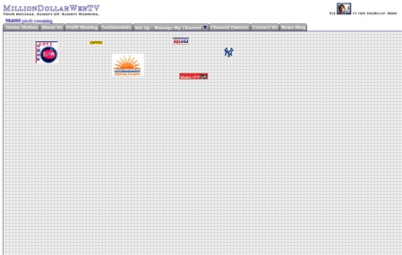
Within milliseconds of visiting MillionDollarWebTV.com I instantly knew what the site was about. However, this is because I’m all too familiar with TheMillionDollarHomePage.com and its many clones. I didn’t need to read anything; the second I saw the pixel-grid, I knew.

So the real question then, is would somebody who isn’t already familiar with TheMillionDollarHomePage know what the site is about.
I’ll have to say no. How could they? There is absolutely nothing on the front page that states anything even remotely to describing what the site is about. The tagline/slogan underneath the logo is “Your Message. Always Up. Always Running.” — but that doesn’t help to describe anything.
There definitely needs to be a more clear message explaining what their site is about. Even adding a simple message up top along the lines of “Purchase pixels and advertise your site through video ads” would be a good start.
There is no mention on the front page that there is even anything for sale. They do have “984000 pixels remaining”, but they should clearly state that they are selling advertising space through pixels, and that each cell, or 100 pixels, is $100.
2. Does the “About Us” page do a good job explaining the benefits?
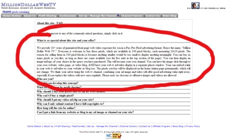
Unfortunately again I’m going to have to say no. While it does answer most of my questions, it is presented in a very obfuscated and overly-complicated way.
Instead of easily describing how the process and system works, visitors seem to almost have to research it themselves.
My first suggestion would be to change the font as I think they’re using the default Times New Roman, and to PARAGRAPH. The screenshot below shows how difficult it is to read:

I would also suggest adding a new page on their site called “How it Works”, and use this as their main “selling” page. On it they should explain in as few words as possible and as simply as possible how their site works.
I would then create a FAQ page and move some of the questions they currently have on their About page such as “How did you develop this concept?” and “Can I put a link from my website or blog to my ad image or channel on your site?” over there.
I would then keep the About Us Page to simply what it should be used for: to introduce themselves and share a bit of information of themselves. Their About page right now is trying to handle too many things and gives an information-overload.
I really think that dividing the current About Us page into three separate separate “How it Works”, “FAQ”, and “About Us” pages would benefit the site.
3. How easy is it to register and to place an order?
After filling out their registration form and hitting submit, I had to wait for around 20-seconds for the form to process and go through. This is an eternity for waiting times, and I came very close to canceling it, so I’d suggest for MillionDollarWebTV.com to look into that, to see if it’s something with their server and a regular occurrence that they need to address, or was just an isolated incident.
Their form also had me enter a CAPTCHA/Turing code. This is just a personal preference/suggestion, but it’d be nice if they changed that to use a “Human Logic” question such as “What is the opposite of day?” or “What day comes after Monday?” to make it easier for people like me who often get the CAPTCHA/Turing code incorrect.
Once my form did go through, I got the activation e-mail instantly, activated my account, and logged in.
Buying pixels and placing an order is actually quite easy, simple, and self-explanatory – just the way I like it, so this is one good thing they’ve done right so far.
However, I found one major oversight that should definitely be addressed. I love it when I review a site and find such oversights, because it both lets me pat myself on the back for finding it while also letting me notify the owners about it so that they can fix it.
The oversight I found was that at the end of the ordering/purchasing form, MillionDollarWebTV.com presents you with another CAPTCHA/Turing code! Now, at first you may think “So what? It’s another form? Better to be safe.” But remember that this page can only be accessed from already-registered members who are logged-in. Members who have already answered a security code when they registered, and members who have confirmed their e-mail address.
I’d highly recommend for this to be removed because it’s useless, redundant, and just slows down and complicates the purchasing procedure.
I didn’t actually pay for an ad so I can’t comment on what happens after, but once I sent my order form, I was sent to PayPal so everything looks like it works fine.
All in all, the actual registration and ordering of pixels on the site is pretty good, save for the extra CAPTCHA 🙂
4. How enticing is our profit sharing program?
Apart from using video as the advertising medium on their site, MillionDollarWebTV.com has also implemented a profit-sharing program.
Unfortunately, at least for me, this does very little to persuade my decision to buy pixels. Firstly, their profit-sharing is not explained in detail on their Profit Sharing page – it appears that 100% of the site’s secondary income from 3rd-party advertisers will go back to pixel owners. But it isn’t explained like that, and it also doesn’t explain how members will be paid; will they be paid once a month? Once a year? As soon as the payments come in?
They way they describe it too does not sound concrete or reassuring. They are basically saying “If we make a lot of cash from advertisers if we grow big, we’ll give it back to you”, so it’s hardly a big incentive.
Now, if MillionDollarWebTV.com was larger or already had some 3rd party advertisers (which they do not currently), and explained in greater detail just how their profit-sharing would be paid out and when, how, etc., then it may be a larger benefit, but for now it does nothing for me.
5. Is our blog interesting and informative?
In short, yes. It’s nothing amazing, but it is fairly interesting and informative. The photos definitely help.
I do have one very basic but helpful suggestion though. There are currently no dates attached to each post, and while I can understand the argument of not doing so because they may not update frequently, I still think the benefits outweigh the consequences.
I simply found it uncomfortable skimming through the posts not being able to see dates. Was the last post written a month ago? Are some of these from 3-4 months back?
Knowing this really matters to me because as a potential consumer of their site, I want to know how hard they are working on their site. If their news and updates are far and few inbetween then I want to know about it. If they are recent and posted often, then it will help to improve my disposition.
Additionally, if I see that the posts were posted recently, then it makes me want to read them more, as they seem more relevant to me, as opposed to if they are a month old and ‘dry’.
Heh, it’s amazing how one small thing can make a lot of difference, eh? 🙂
6. Would you use MillionDollarWebTV.com and recommend it to your friends?
This is the real million dollar question.
It’s always hard for me to say negative things about a company, product, service, or site when they’ve paid me to review them, but I have to be honest as always. The fact that they asked this question means that they are open to possible criticism though, so that’s a good thing.
Would I use MillionDollarWebTV.com? No. Would I recommend it to my friends? No.
As stated in the introduction of this review, TheMillionDollarHomePage.com‘s surprise success spawned nearly a million copycats, which as we can see here are still coming. There are probably a few hundred, if not more, such sites on the web now, but they are all forgetting the most important thing: buzz.
TheMillionDollarHomePage.com was successful because it was new and creative. After a bit of marketing and buzz by Alex Tew (the creator), media outlets started carrying the story, followed by large news corporations such as CNN. This all resulted in a snowball effect whereby the more advertisers who purchased ads, the more Alex had come to making his million dollars, and the more interesting the whole story got.
The Pay-Per-Pixel model worked because it was new. Now that it’s not new anymore, there is no reason for people to visit MillionDollarWebTV.com. Remember, there has to be a reason for advertisers to spent $100 per TINY 10×10 pixels. But MillionDollarWebTV is over 1,000,000 Alexa and their site traffic is very small according to their blog. Sure, my ad will be there for at least 10 years, which does make a difference, but why would I pay for an ad on a site that receives no traffic?
Another reason why I wouldn’t use MillionDollarWebTV is for SEO reasons. I give them points for trying to be a bit different by going the whole video angle, but that actually backfires for them in a way: SEO.
With TheMillionDollarHomePage, your pixel ad was linked to your website, plan and simple. But with MillionDollarWebTV, your pixel ad is linked to JavaScript which opens a window displaying video. This both reduces your CTR as well as eliminates any possible benefits of SEO.
And I’m sure that SEO was one of the main reasons most advertisers bought ads on Alex Tew’s site.
So there’s my review. It was a bit harsh but I had to be honest. Hopefully MillionDollarWebTV.com won’t shoot the messenger (of bad news) and will implement some of the suggestions.


Completely agree, the site owners really need to buck their ideas up, or atleast work on the practical side of things.
Though at least they didn’t totally rip of the themilliondollarhomepage.com. There idea is a bit original lol 🙂
They have one of the worst designs I have seen. No way would I consider buying anything there.
lol This is site is garbage. trying to copy the pixel idea
i hate to bash but this site is…well words cannot describe its originality or lack there of.
sorry
::laughs:: Well, one guy pulls an idea off, and 200 try the same thing. 😛
200, try 200,000! I have seen a ton of these sites out there. Many of them start off thinking they will make a bunch of money, then they just switch over to giving them away for free. It is a waste of good internet real estate.