My New Mascot Logo
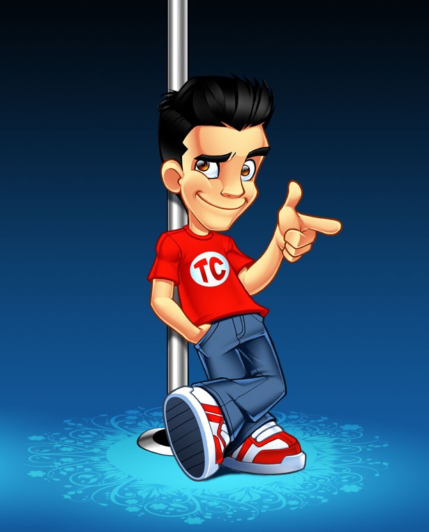
February 1, 2008 Posted by Tyler CruzA couple weeks ago, I commissioned for a new mascot/cartoon pose to be made from Sergio at SOSFactory.com. Here it is (the pole, background, and floor design are just for show and aren’t actually part of the mascot):

What do you think? There isn’t a whole lot to comment on, I know, since it’s just a new pose.
So why did I pay $300 to speed up evolution and walk erect? Well, first off, my new pose won’t be replacing my current one. I purchased it simply to have another pose in my arsenal. Limiting myself to one pose is good for a while, but can get stale. By having other poses, it helps secure and identify my visual brand and image better; I’m no longer just a guy sitting with some poker chips and a laptop.
You’ll notice that I kept my “gun-finger” gesture. This helps to immediately associate my mascot with Tyler Cruz, not having people mistake it for just a similar-looking cartoon.

There’s one very important change, however, in both my poses. Did you notice it?
My shirt is no longer just plain red, but now has a “TC” logo on it. This was a very important request I had made, as I needed something to brand it even better, leaving no mistake that it is me, Tyler Cruz.
When I was getting my first cartoon done, we played with the idea of putting “TylerCruz.com” on the back of the laptop. This would have worked great, but then I would have been committed to always using the laptop. By slapping my initials on my shirt, I can be in any pose, and away from my laptop.
Ideally, I’d have “TylerCruz.com” on the shirt, but that was impractical due to design ratios – It would have been very difficult to make out due to the size of my shirt compared to the rest of the image. The “TC” is the next best thing though.
I also wanted the “TC” addition to the logo to help prevent others from using my image. While others could still easily copy the image and use it as an image of a guy at a laptop, at least it’s now a bit more linked and tied to my blog than before; somebody may have seen it before but forgot exactly where, and the “TC” might help remind them.
New Pose, New Opportunities
Getting back to my new pose… here’s another major reason why I decided to get it: versatility.
Remember when I purchased 10 banners earlier this month? I was only able to give the designer one pose to work with, and so all the banners have the same “version” of me:


My new standing logo would looks great in all of those banners – much better than sitting – and since I have the PSD’s of all the banners, I’ll be able to make new variations of each of the banners… essentially giving me 10 new banners.
I can also use the new pose for other things. For example, I’ll probably be using it in a future promotional/endorsement post, where I’ll have it positioned so that I’m pointing to a company logo or website.


I like it. Looks good and yes it’ll give you more versatility in your branding.
Rich
Yea I haven’t seen any logo remotely similar as of yet. the quality is superb.
It’s much better now. At first when I landed on your site and saw your mascot, I mistakenly thought your blog talk all about poker stuff. Your new mascot is better. Why don’t you change your favicon to either the “TC” in your shirt or the face of your cartoon character or the “gun-finger” gesture. Just a thought to better identify your new character. 😉
Thats a great new fresh change to the mascot, I definitely noticed the TC changed right away.
I too have a fresh new look, although not a mascot!
I haven’t commented here in while Tyler, but had to this time.
I like the mascot, but I had a good laugh cause it looks like you’re mascot is hanging out in a strip club like he owns the place.
Then you mentioned walking erect! Haha… yep that’s how my mind operates.
I guess your mascot will be doin some Big Pimpin’, eh.
Hehe, yup.
For those wondering though, the pole is just for the display of the mascot… it’s not part of the actual final product 🙂
I like the pole… I always love poles.. 🙂
Looks much better tyler $300 seems a really good price for such quality.
Thank you for providing the company that you have been working with for your logo/design. I was searching for a company that would be able to do this type of graphics design. I think your new design is great and maybe down the road you can do a few other ones to have “for a rainy day”.
Thanks
Looks pretty phenomenal work 🙂
hey cool new logo. I had a quick question, how would you set up an advertising page like you have at the top. Is there a program you use? I’m trying to set one up on my site but I don’t know how. Any information would be great, Thanks!
I didn’t use anything… it’s just a basic static page 🙂
o ok
Looks very refreshing.
Hey Tyler. I gotta say.. even though the floor is not part of the actual mascot, I love the design. You might want to consider using it 🙂
The design deserved a WOW. If I have enough resources, I will spend on it as well.
The new pose looks great 🙂
-Mike
Great design work, I glad you showed us who did the work as I may use them now!
Thank Tyler.
Looks great Tyler. You’re reasons are just for having a new pose!
Well it doesn’t look too different from your old one but it still looks good. Nice design work.
-Gyutae Park of Winning the Web
Definitely some good mascots up there. They do good work.
Hey Tyler, the new design looks awesome man. I just started reading your blog like a month ago and I just want to say congrats on your overall success and its people like you that keep my positive attitude towards making money online. From a fellow Vancouver Islander (Victoria), Keep it going man!
Hey Tyler, thanks a lot for the link, much appreciated.
And thanks again for another easy, fast and nice order. Contact me whatever you need.
Cheers.
Sergio
whoever created that is really talented.
The sole of the shoes are different and you do know your leaning on a stripper pole
Hahaha, never thought of it that way!
Awesome work…I’m having mine done for less than half the price of yours 🙂
Lets see if the quality is less than half too 🙂
Less money doesn’t mean less quality. If it was then why would all these companies move to India and China?
So tempted to quickly whip up some flash of you taking off the shirt and pole dancing … oh what I’d give for a spare 2 days to make that! 🙂
So the next ‘pose’ will have you swinging on the stripper pole behind your mascot? Now try focusing on bumping up your income.
I see that you have changed also the shoe 😛
Using “TC” makes complete sense to me, the same way I use “LIC” wherever I can for my blog. Excited to see what all you can do with the psd files.
Great logo Tyler, the designer definitely deserves credit for a job well done and $300 is quite common sense considering the quality of the final product.
Best wishes,
Alan Johnson
Very stylish. I would definitely click one of those banners. And the new character design isn’t too bad :-p
Too similar to johncow but nice anyway.
[…] you make is going to stick in people’s minds. For instance, over at Tyler Cruz, he got new mascot logo made, but also got some new ads made. It’s those ads that I want to talk […]
That is an awesome logo. Incredible.
I like it when logos are “freshened” up! It keeps your page looking up-to-date!
The new logo is very clean… I like it.~ 🙂
[…] mascot and Blog design stand out amongst so many other Blogs out there. Although I was already looking […]
[…] and a half years ago, I commissioned for a custom mascot logo to be made of me for my blog. It wasn’t cheap as I went with the best designer in the field that […]