The Designers Behind Movie-Vault.com
September 10, 2009 Posted by Tyler CruzBack in April I recommended the company that does my banner design work. I knew that they did all type of design work and not just banners, but I didn’t have a need for anything until now.
They were the obvious first choice to go with to do the new Movie-Vault.com design as not only had I seen good results from my banner orders, but their web design portfolio has always impressed me – and that’s not an easy thing to do.
The company I’m referring to is 4design.tv. What they lack in domain name creativity is more than made up for with their high quality design work. 4Design.tv is a husband and wife (I’m assuming they’re married since they have the same last name) team based out of Belgium, although I’ve only ever dealt with Nathalie myself.
There isn’t really much to say since their portfolio speaks for itself and so this post will be very short and sweet.
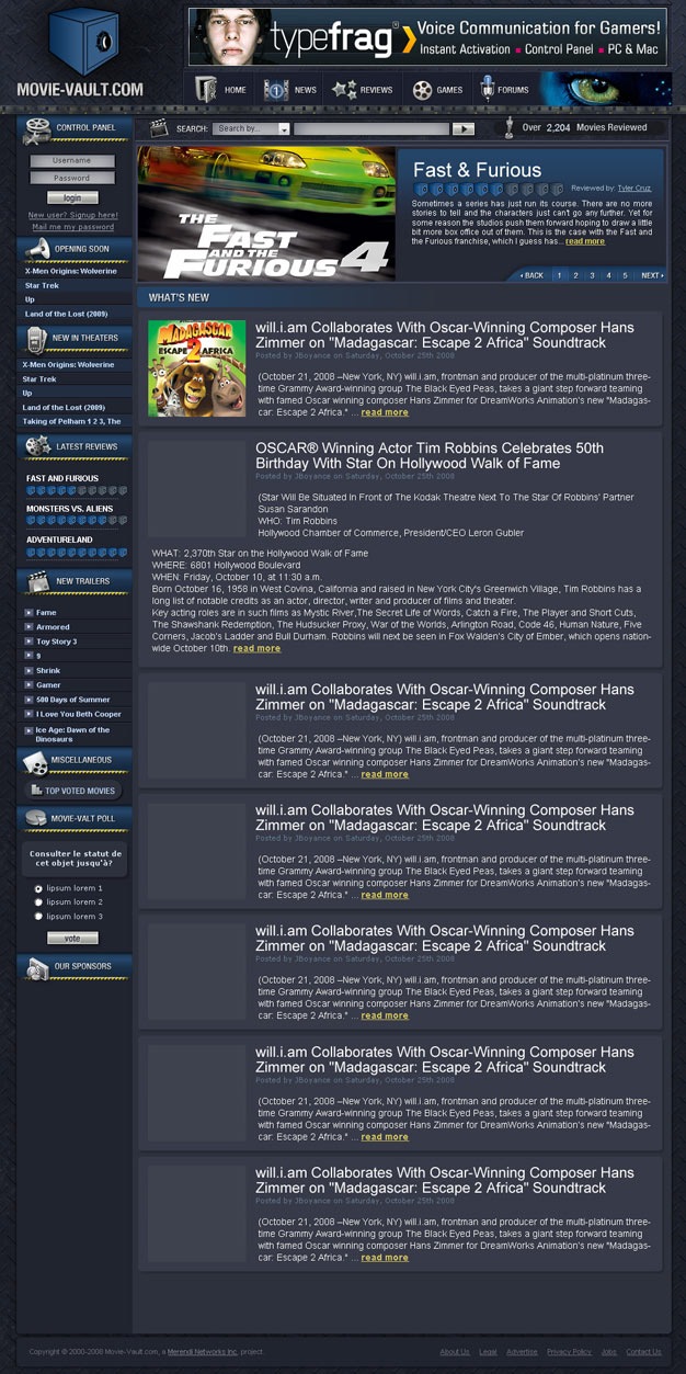
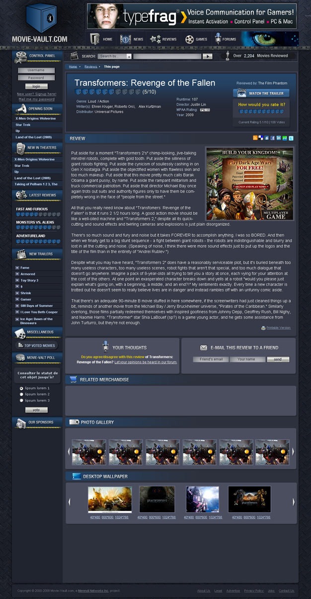
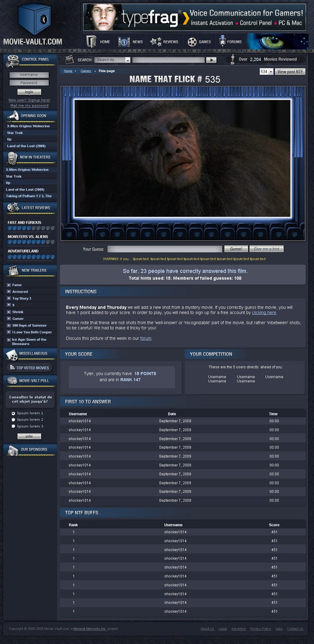
Below are 3 screenshots of the completed designs of the new Movie-Vault.com which they did for me. All of this was done for just under $1,000! It did not include coding to HTML/CSS since my programmers are doing that.
Under each screenshot is a link to the full image in high-resolution:
The Main Page
High Resolution Image: (View)
I can’t wait to see the Featured Reviews section coded and in action (the Fast and the Furious 4 section up top). It will utilize AJAX and transition between movies automatically.

The Review Page
High Resolution Image: (View)
The review page is the essence of the site and the site’s focus. I’m obviously biased here, but I think the 300×250 banner fits in so well into the review… so much in fact that I think it actually looks better with the ad!
While fairly simple, the new review page is still a big improvement over our old design.
The photo gallery and desktop wallpaper sections at the bottom will rotate (upon user action) through AJAX and will add a lot to the site. I’m also excited about adding the trailer feature as that is something we didn’t have before.

The “Name That Flick” Page
High Resolution Image: (View)
I created a simple movie-still guessing game called Name That Flick nearly a decade ago that has since become one of the (if not the most) popular areas of the site. Since it has become so popular (with many addicts: see the 12th post down here) I felt it deserved its own special design revamp.
In addition to having a much larger image (700 pixel width as opposed to 550) and being encased in a nice theater setting, there will be a lot of new and improved features that will surely excite many of the current members and NTF players.

4Design FTW!
One of the most valuable things I can give away on this blog are the recommendations of the service providers I use. I used to keep these a close guarded secret but found that sharing them can sometimes get me discounts in the future 🙂
4Design.tv doesn’t have a referral program, so if you do hire them, please let them know I referred you. Maybe they’ll give me a discount on my next order 🙂
If you do use them, e-mail me the finished design as I’d love to see what they come up with for you.


Their website looks very impressive. Damn
I like this new design for movie vault 🙂 great site
Tyler, thanks for showing us your progress! Maybe you should add the trailer feature direcly under the ad (if you look at the review page), there´s enough space for the foto section to float right next to the actual review.
Greetings from Berlin!
The website looks really great. I can’t wait to see the finish product. Greg Ellison
I’ve dealt with 4design before, I agree on the domain name especially the .tv part, but their work is top notch.
btw the previews look great and are definitely a big enhancement compared to the current design, but why did you opt to stay with a similar color theme of the website instead of going with perhaps brighter and more web2.0’sh style?
Damn! Those guy’s website is sweeeet! Definitely bookmarking them for future reference, thanks!
-James
Huge improvement on the current and a good job in general by 4design, seen a lot of there work before. I agree with Sohaib though to a certain extent, although the colours etc fit in well with the name the design itself just comes across as old fashioned. It’s as though it was designed 10 years ago, I still like the design I just feel that it’s lacking something to make it really stand out.
Yes I’m quite sure it will do very well. I’ll have to keep 4Design in mind for when I need a new website design.
I also worked with Natalie from 4Design. She is the main designer…I think her husband only does Flash work. Highly recommend Natalie for all of your design work. Sheldon and Natalie were my favorite designers at WHT forum.
Back then most of the stuff I did were custom scripts. But now with opensource scripts, especially WordPress has taken off so much that you can find great designs at fraction of the price.
Wow it looks like this site is really progressing. I’m sure it will do quite well. I’ll have to keep 4Design in mind for when I need a new website design. They seem to do very good work for a reasonable price.
nice… themes..it really fit with the movie topic..
Very Nice, Tyler!!
I like this design, fits for a movie site. Nice job tyler.
Impressive web design, I will have to see if they want to joint venture with me on some projects.
Thanks for the reference Tyler 😉
shopping cart web development
The designs are pretty good but I can say that the price is still to high. You could get a good design on digitalpoint by having a contest at a less price.
Personally I don’t think a website design is where you want to try to save money. It is so crucial to your website’s success that you can’t afford to just go for the cheapest option. Most people would rather pay the money for a great design instead of settling for just a good design.
Whoa, they did a great job on the new look to your MV site. Can’t wait to see the live site!
Wow, the design looks really good and fits the movie theme perfectly. I like the idea of guessing what movie it is from the still shot.
wow, great designs!
bookmarked them already
Hey Tyler,
I’m actually a little interested on how you actually found them. Or did they find you? You said it was your obvious choice but does that mean there were other potential designers you’d considered going with?
Just curious…
Jay
[…] The Designers Behind Movie-Vault.co­… […]
You are absolutely right. 4design.tv portfolio is excellent. And you web site looks great.
Wow.! amazing design. The site has a good quality. It is simply great. The site really deserves to be referred. I will bookmark this one. Thanks for sharing.
Looks very very nice, Tyler 🙂 Great job by your designers…and you of course.
-Mike
I am glad that you are getting such cool looking site & definitely it impressed me in 3 areas strongly:
1. Use of basic structure in variation for different pages, which suits the need of viewers eye movement & important content.
2. Color.
3. Column arrengement for activity oriented plan.
Amazing work on the site. These guys really know what they are doing. Thanks for the link 🙂
Wow it looks like this site is really gain alot amazing work on this.excellent keep it up tyler my friend .ehheh
Network Marketing
Tyler the link to the “High Resolution Image” is not working and leads to the a 404 error 🙁
Till then,
Jean
That’s okay, because the new site is now up and running 🙂